Part 2: Using parameters with actions in Tableau.
Being able to set parameters in your data visualizations is a key component of data analysis and business decisions. In this article, we’ll explore the use of parameters with actions. This article continues what was covered in article “Part 1: Using Parameters in Tableau Visualizations”.
In Tableau, you can control parameter values using actions. Setting parameter actions lets users change a parameter value through direct interaction with the dashboard. These interactions can be such as clicking or selecting a mark. You can then use your parameter actions with reference lines, calculations, filters, and SQL queries, and to customize how you display data in your visualizations.
As you learned in the Part I article, parameters are values you set independently from the rest of the data. Because parameters are a global feature in Tableau, they allow you to control any sheet or dashboard you create within the same workbook.
The following example explains how to manipulate the values of your parameter dynamically using actions.
To use parameters with actions, you will need to:
- Create the parameter that will be controlled using actions
- Apply the parameter to calculations, filters, or reference lines
- Define the parameter action
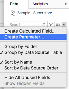
You access parameters by clicking the down arrow in the data panel of a created sheet and select parameter from the dropdown menu (fig.1).
For this example I am using the sample-store data you can download from the Tableau resources. We will use action to interactively update a reference line, without using a calculation.
Lets first create a couple of parameters we will need in our exercise:
I created a parameter named “Sales-parameter” with the following settings.
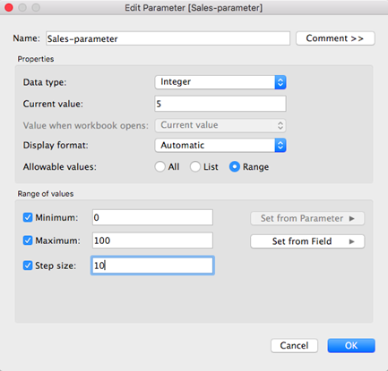
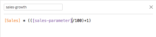
Sales-parameter has a value between 0 and 100, which can represent a percentage growth value. I applied the parameter to a calculation using the following formula.
For my visualization, I created a stacked bar chart showing both sales and sales growth
as follow:
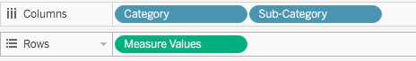
Drag Category and Sub-Category fields to Column, and Measure Values field to Rows.
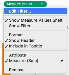
Click the Measure Values pill in the row shelf and select Edit Filter from the dropdown menu (fig. 3).
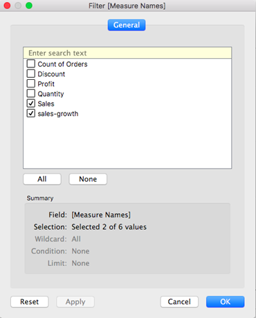
Deselect every value apart from sales-growth and Sales which we will represent in our stacked bar chart (fig. 4).
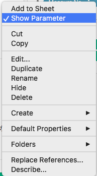
Click Sales-parameter down arrow from the Parameter data pane and select Show parameter from the dropdown menu (fig. 5).
This will display the parameter on the right side with your graph as follow (fig. 6)
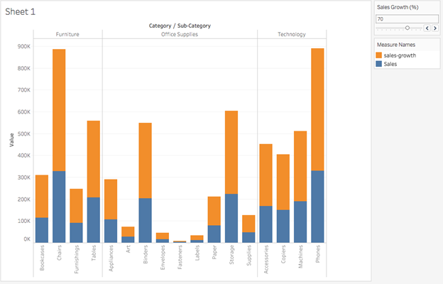
You can now dynamically control the sales-growth values using the slider control.
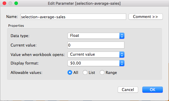
I will create a second parameter “selection-average-sales” which I will control using the parameter action. I want my parameter to aggregate the average sales values of all the marks I select in my visualisation.
Create your new parameter as follows (fig. 7). Because I am setting the parameter to Float, it will aggregate the values selected on the chart.
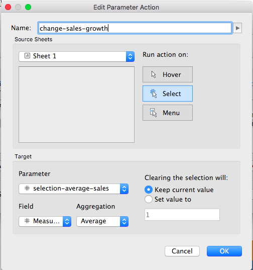
I now need to create the action to control the parameter value. The parameter action must include the following:
- the source sheet or sheets it applies to.
- the user behavior that runs the action (hover, select, or menu).
- the target parameter, the source field, and the respective aggregation (if applicable).
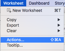
Select Actions from the worksheet dropdown menu (fig. 8). Set your action as follow (fig. 9):
-Run action on “Select”, and set your target Parameter to “selection-average-sales”
-Set the Field to “Measure Value” and the Aggregation to “Average”.
This will assign the average value of the bars we select on the visualization to the parameter “selection-average-sales” we created.
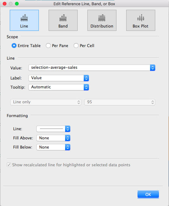
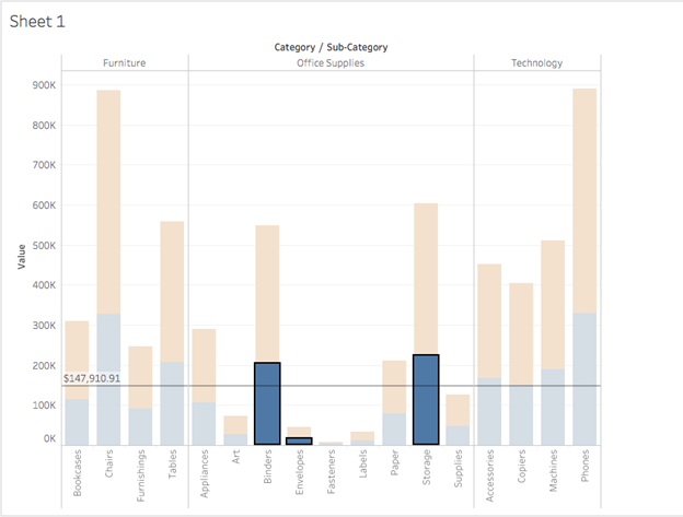
Create a reference line to display the average value from the selections as follow:
-From the Analytics panel, click and drag “reference line” to Table,
-From the pop-up window, in Value, select “selection-average-sales” and set the Label to Value to display the actual value on the reference line (fig. 10).
You can now test your action as follow:
In your chart, if you (alt- mac) or (option- PC) click on multiple bars, Tableau will automatically display a reference line showing the average Sales for the selected Sub-categories you highlight (fig. 11). This provides you with a convenient way to compare average sales values for multiple sub-categories.
Conclusion
This is only an introduction to what is possible with parameters action. You can for example use action to let users control what information is being displayed in a view, or compare data for multiple years on a line chart. This article described one of many ways parameter action can help you get to insights faster and design flexible experiences in Tableau.