Besides using the Color Marks Card in Tableau, Colors play an essential role in understanding your data visualizations.
Learning to format your view with correct and appropriate colors can make the difference in your audience being able to analyze and gather insight about your data.
Using Tableau Color Tools
Qualitative value fields
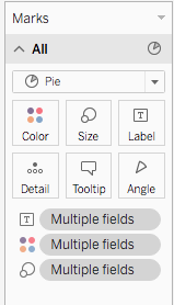
figure 1
By dragging and dropping a field with discrete values (typically a dimension) into the Color Marks card, you can assign a color to each value of the field (fig 1). You can then customize your view with Categorical palettes that are appropriate for your fields.
Click the More colors button to access the Color palettes (fig 2).
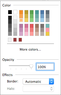
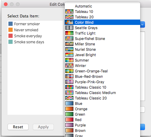
figure 2
Quantitative value fields
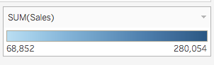
You assign a color to a continuous value field (typically a measure) by dragging it to the Color Marks card. Tableau then displays a legend with a continuous range of colors, for example, the number of sales (fig 3).

figure 3
You can change the colors used in the range, To edit colors, click on the down arrow in the upper right of the color legend and select Edit Colors from the menu (fig 4).
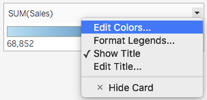
figure 4
Diverging Color Scales
In the case of diverging colors, think of your scale as two sequential scales that share a low value, and in which you can modify the distribution of color, and other properties such as Stepped Color, and Reversed to change the order of your scale (fig 5).
Access additional options by selecting the Advanced button to determine a Start, End and Center (fig 6). The Start value represents the lower limit in the range, the End value is the upper one, and the Center is the position of your mid-point on the scale.
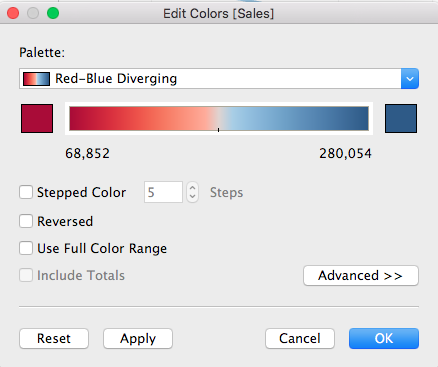
figure 5
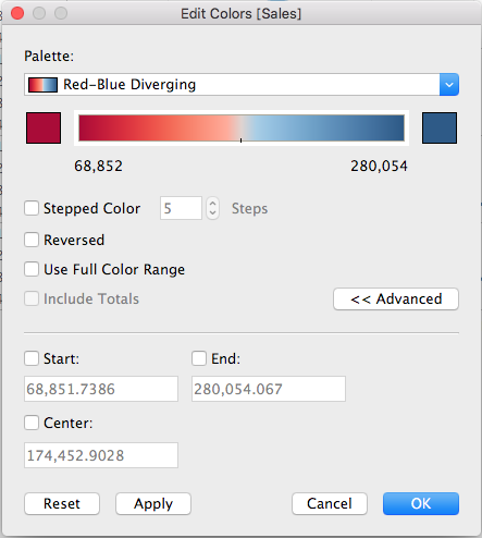
figure 6
What to consider when choosing colors?
When creating your visualizations, it is important to think of the usefulness of colors for your graphs, and priority should be given to encoding your Dimensions and Measures fields using the color marks. Besides making it easier to differentiate each category in your analysis, Colors allows you to highlight patterns as well as interrelationships within your data, however, some design principles should be respected.
-
Consider the context of your graphs: are your graphs industry-specific? Are there any cultural specifics that may dictate the color palette you use? For example, certain colors like red green and blue used as a monochrome palette can help you communicate trust and authority in highly-regulated industries like Banking and Finance.

Credit Suisse Global Wealth Report 2019
-
Does your organization have branding in place? Guidelines may have already been set in your organization’s brand style guide on how colors should be used in publications.
-
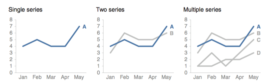
Consider using the same color for the same variables, as this will not only add consistency but also allow your audience to easily compare the data from each graph.
Source: Tableau -
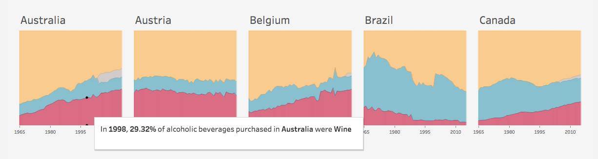
Use one or two accent colors to highlight some of the information, as this is critical to building the narrative of your visualizations, like in the example below.
Source: Storytelling with data
-
For a range of values, you should apply the following principle:
A light tint of color for lower value in the range, and a dark one for the higher values. This is because, by convention, we tend to associate a lighter color with light density or lower numbers, and darker colors with higher density or higher numbers in a range.
-
Make sure your contrasts are high enough. This can be achieved in 2 ways:
-
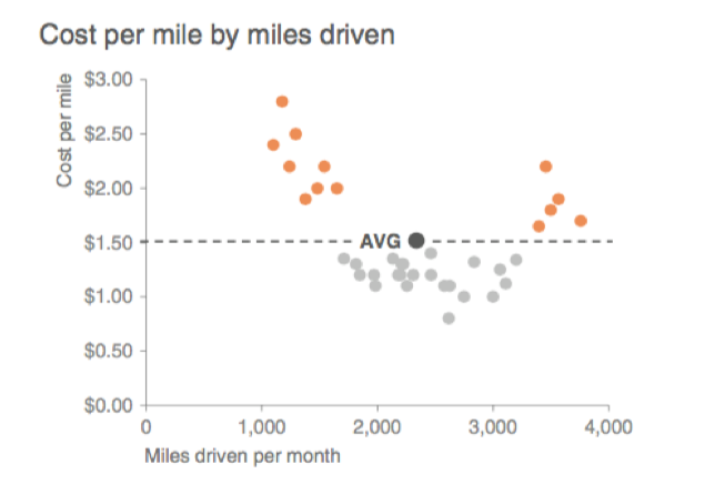
Using a grey for most of the graph information and adding an accent color to draw the narrative.
Source: Storytelling with data
-
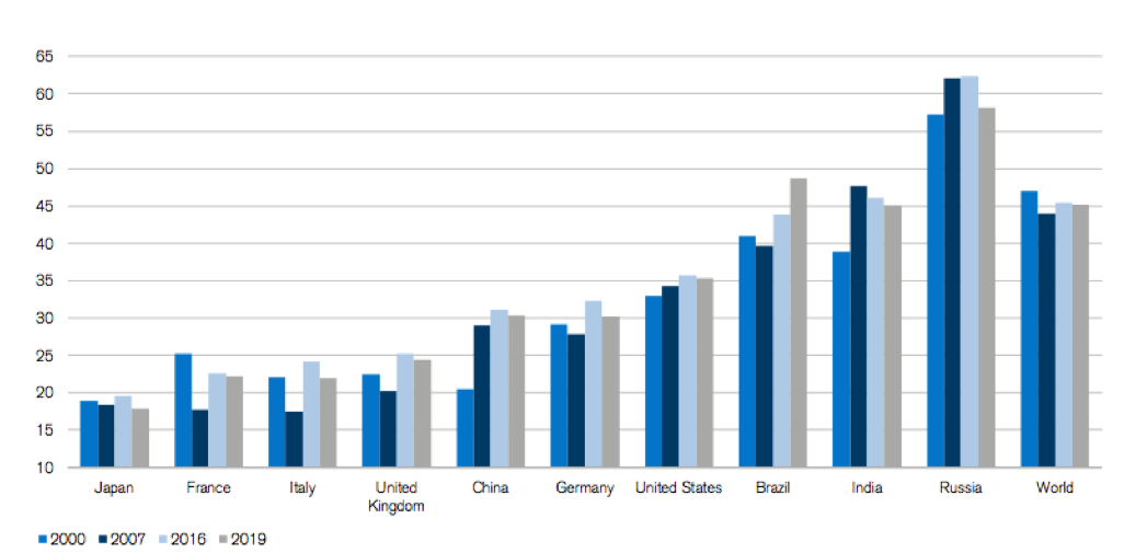
Using the most contrasting colors next to each other like in the bar chart below. This also is particularly important when working with text to add readability.
 Credit Suisse Global Wealth Report 2019
-
Finally, be mindful of color blind people in your audience. There are online tools where you can upload an image of your graphs to check colors for various blindness, Color Blindness Simulator is one of them.
More resources:
Author Bio:
This post was written by Faycal Bouguir, Faycal is a UX & Data Visualization/Infographics specialist based in NYC. He teaches Data Visualization using Tableau at the Career Centers.