In the previous article, we looked at the use of GIS spatial files to create map visualizations. This article aims at taking you further on this path by detailing some useful approaches to choropleth maps.
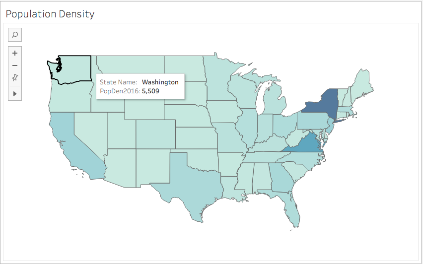
Fig 1.
Displaying multiple fields on your map
You might want to display multiple fields on a map. This process will often consist in adding layers to your map using the dual-axis function. The dual-axis allows you to combine two or more charts to create additional layers of data on a map.
In this example, we first create a map with population field mapped using the color mark (fig 1.). We then drag Longitude (generated) field to the column mark. This generates a duplicate of our map, both will be displayed side by side in your Tableau view.
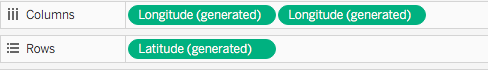
You can then click on the second longitude pill, and from the dropdown menu select Dual Axis to combine the charts.
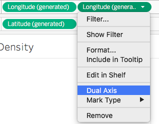
In your marks card, you will notice two longitudes. Remove from the top one the population field you were mapping, then drag another field to it. Choose the circle symbol from the dropdown symbol list to display the second field. To add clarity to our map, we also drag the second field to the label marks to display its values on the map.
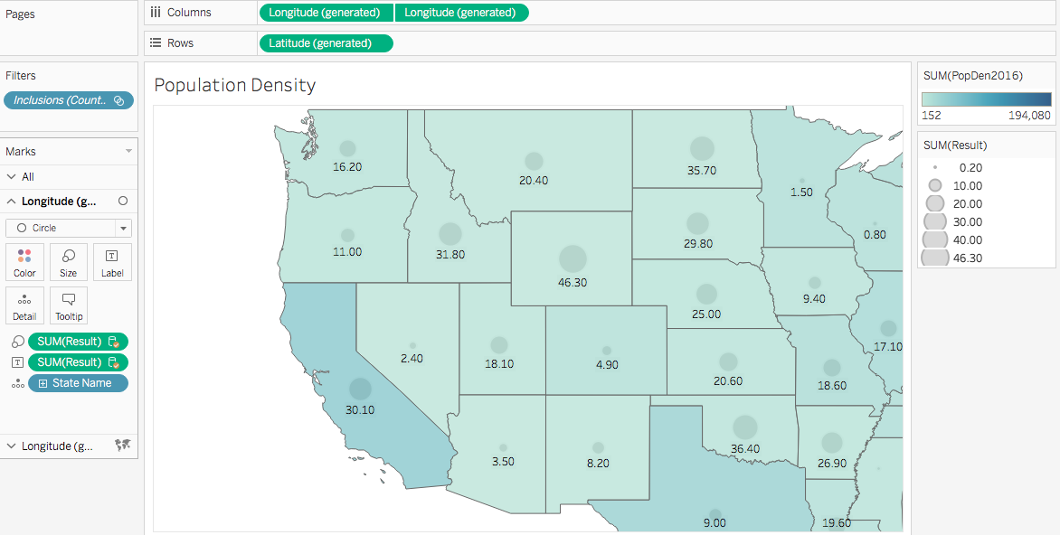
Fig. 2
Bivariate maps to compare similar fields
In some cases you may want to compare two fields of data of the same order on a map.
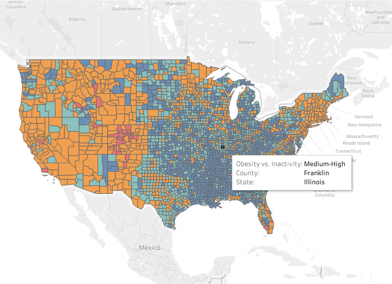
For example in fig 3., we represented the obesity rate in orange and physical inactivity in red for each county. As represented here, it would be difficult to compare both variables and draw any relationship. It is neither possible to see results overlaying the two layers of data on the same map. The best approach for this type of comparison of similar fields is using a bivariate method.
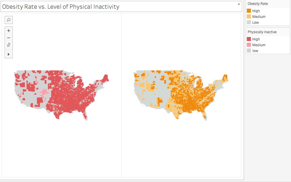
Fig. 3
What is a bivariate map?
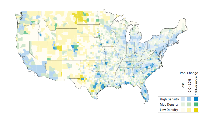
Fig. 4 -source: Sarah Battersby
https://public.tableau.com/profile/sarah.battersby#!/
A bivariate map, similar to the one fig. 4, consists in comparing polygon areas where both fields are represented. You explore the influence of both variables at the same time in one polygon area. In bivariate maps, the range of colors represents the relative importance of each data field. As seen on fig. 4, it is a little like painting each county polygon with a combination of both colors.
How to create a bivariate choropleth map?
We need to first classify our data into groups to simplify reading our data. For example, we group data into classes (low, medium high). To avoid having too many categories, keep each variable groups to 3 maximum. Fig. 3, for the two fields we represented by colors, we can have the following groups:
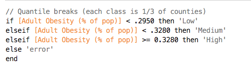
To create fig. 3, we first calculate the quantile breaks for each attribute and entered them into a calculated field. For instance, for the Obesity rate we’ll have the following formula:
This converts our field into a dimension. Drag the new calculated field to the color marks to display it on your map with the above legend.
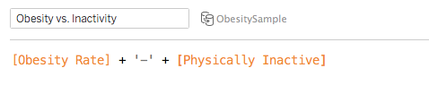
We then combine attributes into a single dimension using the following formula:
Conclusion
As we’ve seen in the bivariate map example, although classifying our data fields into groups introduces some level of subjectivity, it is nonetheless a reliable way to represent our data to see the pattern on our map. We could further customize our visualization with colors and create a legend for the bivariates data. I will detail how in a separate article on the use of colors for Tableau visualizations.