
Why is Important to Learn PowerPoint?
It’s hard nowadays to find any business environment that can’t benefit from using PowerPoint. Whether you’re showing the features of a new product or service, or explaining the steps involved in a project, PowerPoint is the go-to screen presentation program that can help make your meetings a success.
What’s the Big Problem?
The number one problem that can keep people from using this powerful program to their advantage is not understanding how to use the program correctly. Not only does this mean that the presentations won’t be effective, but it also means that there will be hours of wasted time, which also means wasted money. And in many cases, users will actually create problems for themselves!
One issue is that Microsoft Office is a rare instance of a suite of programs used both by professionals and consumers. So it’s entirely possible to work in the program without any formal training – but while doing things incorrectly might seem reasonable in the short term, this can cause issues down the line that might even stop the file from working.
Another issue is that it’s a graphics program in a suite of business applications. Most people who use PowerPoint have no training in graphics – and this can become a hinderance.
And lastly, it’s impossible to know what you don’t know. PowerPoint is extremely powerful, and often has features that would make people extremely happy to use – if only they knew they existed!
Let’s talk about a few of the most frequent stumbling blocks PowerPoint users have.
PowerPoint is a Screen Layout Program
One of the biggest problems that people have using PowerPoint is that they have no experience in design programs. Now – that doesn’t mean you have to be a designer to use PowerPoint. It just means that they won’t be familiar with how to work.
What’s the Theme?
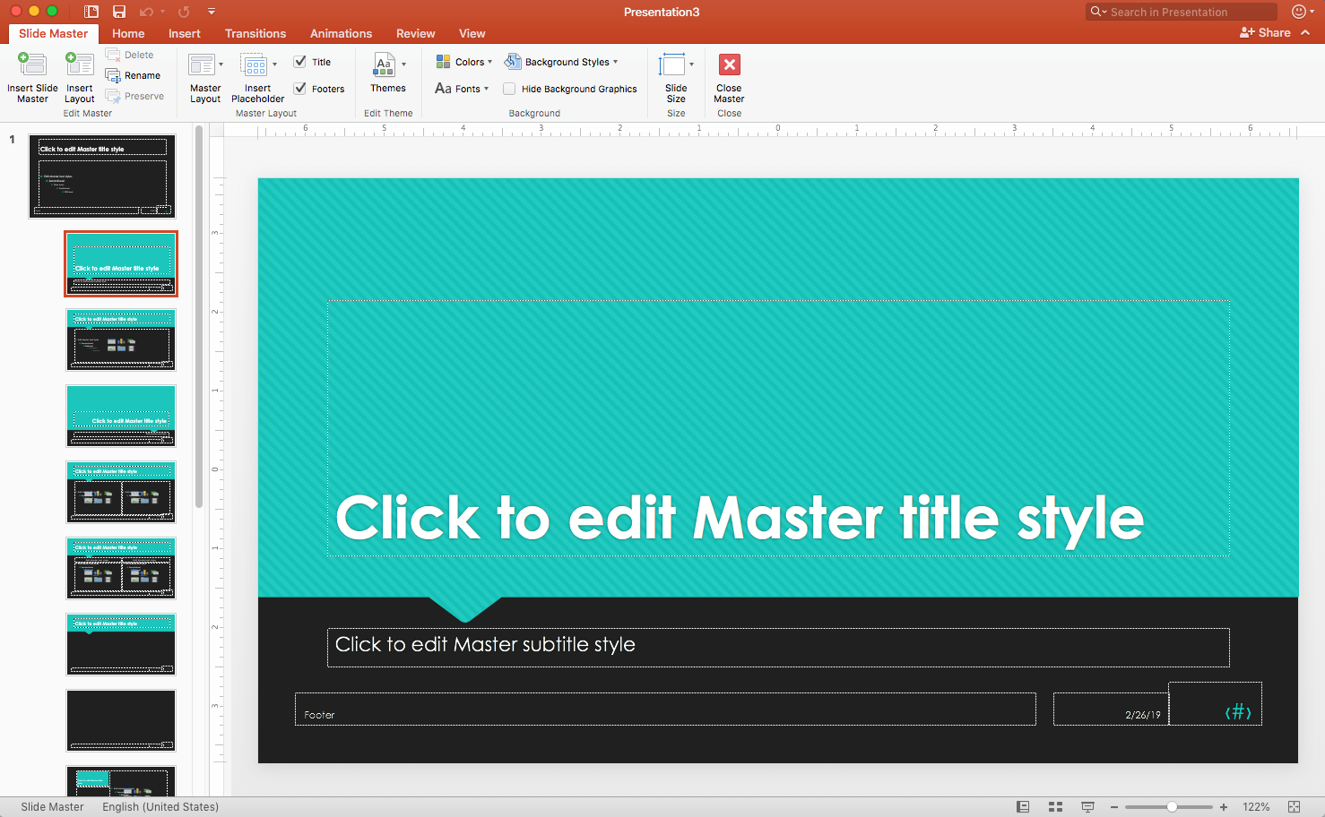
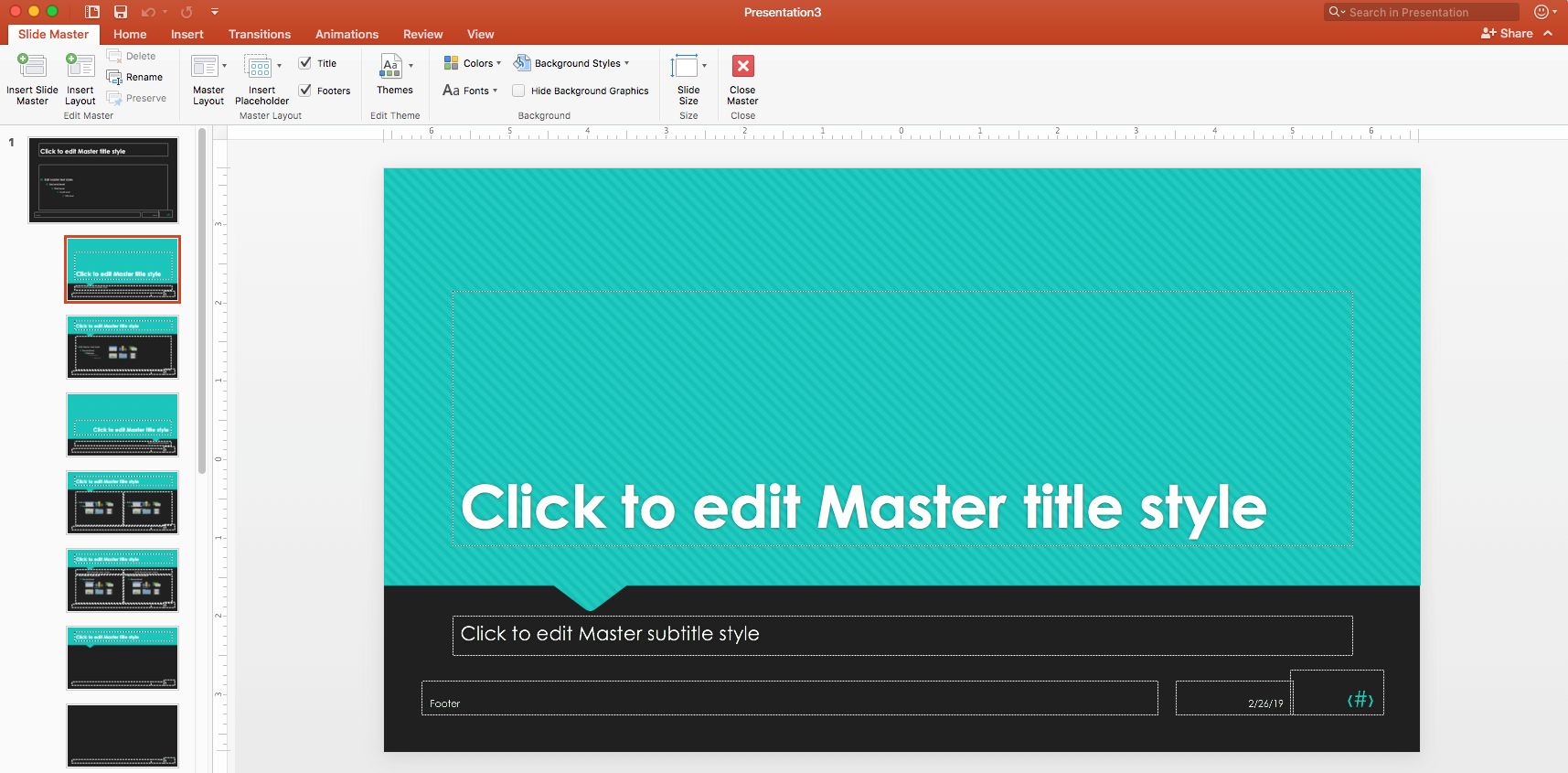
Like every Office program, PowerPoint has multiple views – each for a different type of work. In PowerPoint, all of the design and layout is done in the Slide Master View.
This helps for several reasons. First, it allows you to set the basic design very quickly – and make any changes to the deck (or presentation) just as quickly. Most companies have a particular theme they use for all of their media: the fonts they want, the colors they want, and background elements like color or a logo. By setting up the theme in Slide Master View, this allows you to do it once, and the entire presentation accepts those settings. And if you decide to make a change, it’s instantly reflected in the entire presentation.
Now, imagine the opposite scenario: People have no idea that this feature exists, and they try to do the design in Normal View – while they’re building. If you have a presentation that has 35 slides in it (not unheard of), best case is that you’re doing thirty-five times the amount of work. And since we’re all only human, the likelihood is that it isn’t identical on every slide – and this can cause huge issues with an audience that’s trying to understand the presentation, which is the main if not only reason to have the presentation in the first place!
Let’s talk, however, about the worst-case scenario. If a design theme hasn’t been set, that means even more wasted time – because any change has to be made on every single slide, as opposed to Slide Master where any change just has to be done once.
Getting Used to the Layouts
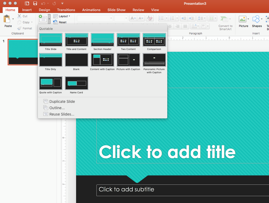
One of the other overlooked features has to do with slide layouts. If you’re not familiar with Slide Master View, you’re likely also not familiar with Slide Layout Masters. These are the choices you see you when adding new slides to a presentation in Normal View. Some users not only don’t know how these are made – but they also tend to ignore them when they build their decks.
Layout Masters are designs for the different types of slides you use in your presentation. Some good examples of these might be default types, like Title Slides or Section Header Slides, or custom ones like Product Slides or Title and Chart.
Layouts can be confusing for your audience, so a good rule of thumb is to use as many as you need – but as few as you can get away with. That doesn’t mean that your content is boring.
Often, layouts are built with flexibility in mind. Each Layout Master lets a designer add Placeholders – boxes waiting in the right place at the right size. If it’s a Picture Placeholder, it shows you exactly where to add your picture so that every picture slide looks consistent. If it’s a Text Placeholder, like a slide title, it’ll be pre-formatted – not only showing consistency in branding but also saving a tremendous amount of building time.
But often, designers will use Content Placeholders – allowing the builder to put whatever they want into it: text, pictures, charts, SmartArt, movies, or tables. So a Title and Two Content slide layout could be used for text and bullets, two pictures, bullets, and a picture, a chart and a movie – whatever content is necessary to get the point across. By using the same layouts over and over, it not only allows you to get the work done much faster – but it also has the added benefit of keeping your file sizes down, and more importantly making it easier for your audience to understand what’s attempting to be conveyed.
Frequently, users won’t know that these layouts are available for them (or don’t want to use them) and make the mistake of trying to create their own in Normal View. As we said earlier, all design and layout is done in Slide Master View – you can’t build a Layout Master in Normal View.
You might be saying: “But I’ve seen that done!” Well, what those users do is conflate text boxes with placeholders. Text boxes are drawing shapes, primarily used for labeling. You often see them in diagrams or used as titles in charts. Your audience won’t be able to tell the difference between a layout placeholder and a text box on the screen. But this creates a few potential issues.
One problem is that when every slide looks completely different, whether no two slides use the same layout or you have multiple two-column slides but no two have elements in the same place at the same size, your audience will spend more time trying to figure out what’s going on than absorbing the content.
Another issue is that often you won’t know a particular design won’t work until you put the content in. If each slide is a custom diagram built with text boxes – everything will have to be manually rearranged. If you’re working properly with layout masters, and it’s just that one particular layout doesn’t serve the content – you can easily swap which layout the content uses, and it rearranges itself.
But Templates with a Theme and layouts serves another benefit: not only does it save time when you build a presentation – you can reuse it to save time for every presentation. And it’s even better for your audience – if they’ve seen and understood one of your presentations, then it’ll be even easier to follow the next one if it uses the same design and layout.
Let’s Get Graphic
There are two huge problems users make for themselves when they aren’t used to working in graphics programs. You can often tell the first one when you see presentations that are almost all text and bullet-lists.
It’s Smart to Use SmartArt
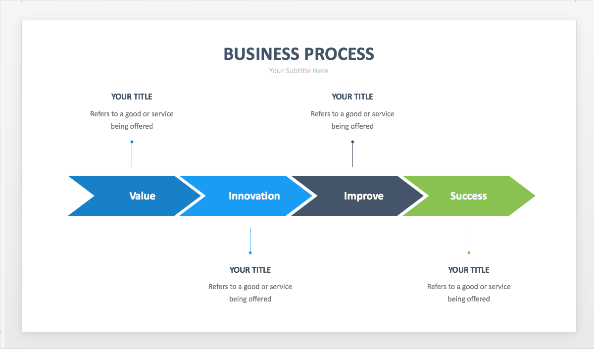
One of the things that can be used to make any presentation easier to understand is SmartArt.
SmartArt is really easy to build: they’re basically shapes grafted onto a regular bullet list. That means creating them is as easy as picking a category and layout, and then just typing. Because they’re just drawing shapes, you can make any changes you would normally make to any shape in PowerPoint: adjusting the fill, the border or outline, and applying shape effects. You can even swap one shape for another if you’re not happy with the presets. And making changes is as easy as can be – since it’s based on text, you just edit the text and the diagram conforms to the changes.
And because it’s just shapes on a bullet list – any bullet list can be converted to SmartArt. So, if you’ve built a slide and think it might make more sense as a graphic than text – you can instantly convert it. And if it turns out you were wrong – you can instantly convert it back to text.
Let’s Picture It

One of the biggest problems that people have with PowerPoint is using images. This has to do with a number of different things that a non-graphic designer likely isn’t aware of.
First, most pictures are what are called rasterized or pixelated images – meaning that they are comprised of a bunch of little dots. Each of those dots can have one of the millions of different colors, and when you put enough together it can look photorealistic. This can cause problems if you’re not aware, so knowing how to get the right types of images is extremely important.
I’m not referring to the fact that you can’t just download someone’s photo without permission. At this point, everyone is well aware that this is stealing. What I’m talking about is how to get the right type of images from either your graphics person/department or your stock photo site.
One thing about pixelated images is that they cannot be resized (especially larger) without losing quality. But if you know the dimensions of the placeholder it’s going into, you can make certain to get the correct size. If you’re shrinking an image way down to put it on the slide, not only will it look worse – but it’ll blow up the file size of your presentation to boot.
Pixelated or rasterized images also have something called resolution. Different from the physical size, this is the number of dots (or pixels) per square inch. With PowerPoint, you have it easy – it’s a screen presentation, so you only need to have screen resolution images. Again – screen resolution is the lowest (72 dpi), so anything higher will look worse and could be up to 10 times the size! Imagine how tough it would be to use your PowerPoint presentation if you had 30 high-resolution images or more in it! Sometimes, it cripples the file making it impossible to use anymore. And for no benefit – just because someone didn’t know better.
What’s Your Vector, Victor?
And not everyone knows about vector graphics. These are not photorealistic, but drawing shape graphics – not unlike shapes in PowerPoint. But vector graphics have a huge benefit if you use them. Because they’re not based on pixels, they can be:
- any size (even larger) without losing quality
- on any background
- always 100% quality – both on screen, and when printed
And because there aren’t pixels or canvas, these graphics are tiny in file size. Most logos start off as a vector because of this, but when people ask for a logo – they don’t know there’s even a vector version. The version or build of your Microsoft Office may vary with regards to if and what vector graphics you can use – so it doesn’t hurt to consult with your IT or support staff.
Let’s Work Together
One of the most significant problems people have is not understanding how easy it is to reuse content from other PowerPoint documents, or how to collaborate with colleagues properly.
PowerPoint has several great features that make it easy to reuse slide content, import outline text, and even have conversations about changes and updates that need to be made.
These features make it easier than ever to have a build team working on files, and incorporating content from multiple sources.
Knowledge is Power
If you’re new to PowerPoint, or you use the program but haven’t had any formal training – hopefully this has given you some ideas on how to be more efficient, and create better PowerPoint presentations for both your company and your audience. A little bit of knowledge can not only make your presentations more effective – but hopefully knowing and utilizing these features will cut back on the amount of zero hour hair-pulling that goes on whenever you put a deck together.
PowerPoint Courses at NYIM Training
Learn these essential skills in our PowerPoint classes in New York City, or request on-site training to upskill your entire team. We also offer a full suite of Microsoft Office classes, including Excel, Word, Outlook, and Access.
- If you want to get all the essentials in one quick day and gain a comfort level with the software, learning masters, templates, and slide transitions, you should look at our beginner PowerPoint class.
- If you want to get down to business and learn PowerPoint for real, learning masters, templates, charts, and animations in-depth, you should check out our PowerPoint Bootcamp