
Learn about three different types of Excel charts to decide which one(s) best fits your needs. Follow our step-by-step examples to create your own engaging and creative infographic.
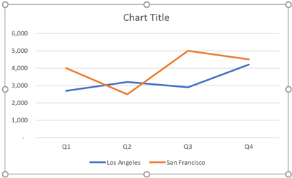
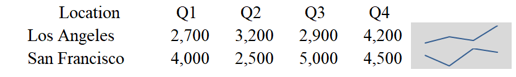
Line Chart
Create a Line chart to show continuous time-series data.
We'll use daily stock prices or daily sales as an example.
How to Create a Line chart
- INSERT >> Charts groups >> select icon for Line chart >> 2D Line/3D Line


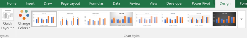
Modify Chart
- CHART TOOLS-DESIGN >> Chart Layout group >> Quick Layout
- CHART TOOLS-DESIGN >> Chart Styles group >> Change Colors
- CHART TOOLS-DESIGN >> Chart Styles group >> choose a Style
Sparklines
- Sparklines are mini charts placed within single cells
- INSERT >> Sparkline's group >> Line
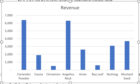
Column Chart
Create a Column chart to display discrete time series data.
For example, data that repeats at a fixed interval of time, like weekly, monthly, quarterly or annually.
Create a Column chart:
- INSERT >> Charts groups >> select icon for Column chart >> One of chart types
Modify the chart elements individually
- CHART TOOLS DESIGN >> Chart Layouts group >> Add Chart
- Axes: Add/remove primary horizontal axis and primary vertical axis
- Axis Titles: Add titles to the horizontal or vertical axis
- Chart Title: Add/remove title at the top of chart
- Data Labels: Add/remove labels for each data point
- Data Table: Add/remove data table from the chart object itself
- Error Bars: Add/remove visualization for standard error, percentage error, and standard deviation
- Gridlines: Add/remove major/minor gridlines to both the horizontal and vertical axes
- Legend: Add/remove/move legend
- Trendline: Apply one of several types of trendlines to the data
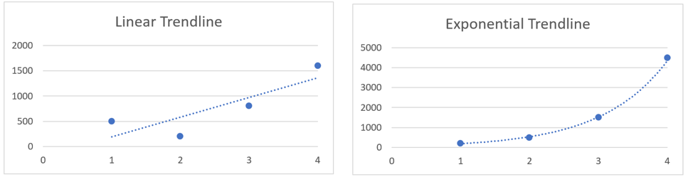
Trendlines:
Trendlines are used to show the prevailing direction of data
- Linear: creates a best fit, straight-line for linear data sets
- Exponential: creates a curved line useful for data that rises or falls at constantly increasing rates
- Linear Forecast: creates a linear trendline that forecasts into the future
- Moving Average: creates a line by averaging a specific number of data points (defaults to 2)
To Apply a Trendline:
- Click on the chart
- CHART TOOLS DESIGN >> Chart Layouts group >> Add Chart Element >> Trendline
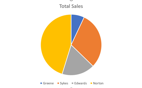
Pie Chart
Create a Pie chart to show the relationship of parts to the whole.
For example: to display market share or revenue by division.
To Create a Pie chart:
- INSERT >> Charts groups >> select icon for Pie chart
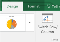
The type of chart can be changed at any time while preserving all pre-selected formatting
- Change the chart from a 2D Pie Chart to a 3D Pie Chart CHART TOOLS DESIGN >>Type group >> Change Chart Type
- Choose "3D Pie chart"
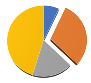
Attention can be given to a sector of the Pie chart, by pulling away a particular "piece" of the pie
- Click on one portion of the Pie Chart
- Each vertex (place where two or more lines meet) will display a small, blue circle
- Click again on that same section
- This time, only those vertices pertaining to that slice will display the small, blue circles
- Click a third time and slightly drag the piece away from the rest of the pie
Learn More About Excel
Expand your marketability and master Microsoft Excel through our suite of Microsoft Office classes in NYC and Excel training courses. Our expert instructors will guide you every step of the way using hands-on training and real-world applications.