
Learn how to combine two or more Excel charts into a single chart, with the option of adding a secondary axis.
Quick Example
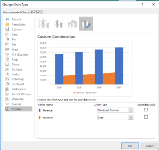
CHART TOOLS DESIGN >> Type group >> Change Chart Type
Add a secondary axis
Adding a secondary axis allows two sets of data, of very different magnitudes, to be graphed on the same chart
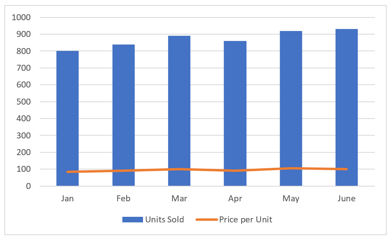
- Without a secondary axis
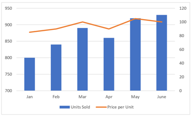
- With a secondary axis
Customize the Chart by utilizing the CHART TOOLS-FORMAT tab
a.) Change the color of the bars
- CHART TOOLS FORMAT >> Shape Styles >> Presets
b.) Change the color of the chart's background
- CHART TOOLS FORMAT >> Shape Styles >> Shape Fill
c.) Change the color of the chart's border
- CHART TOOLS FORMAT >> Shape Outline >> Gold Accent 4
d.) Change the Shape Effect of the chart
- CHART TOOLS FORMAT >> Shape Styles >> Shape Effects >> Bevel >> Soft Round
Master Excel with In-person Training
Become an Excel guru through our Excel courses in NYC or our 3-day NYC Excel Bootcamp. Learn from the top experts with real-life examples.