
In this exercise, we'll convert an existing pie chart into a column chart that better illustrates the sales data by the numbers instead of with percentages.
Getting Started
1. If you have any presentations open, in PowerPoint, go to File > Close to close them. You may have to close more than one.
2. Still in PowerPoint, go to File > Open to open the next project.
3. Under Open, click on On my Mac or This PC.
4. Navigate to the Desktop > Class Files > yourname-PowerPoint 2016 Class folder.
5. Double–click Column Chart.pptx to open it.
6. Go to File > Open to open the presentation we'll take our chart from.
7. Under Open, click on On my Mac or This PC.
8. Navigate to the Desktop > Class Files > yourname-PowerPoint 2016 Class folder.
9. Double–click Sales.pptx to open it.
Deciding Which Chart Best Displays the Data
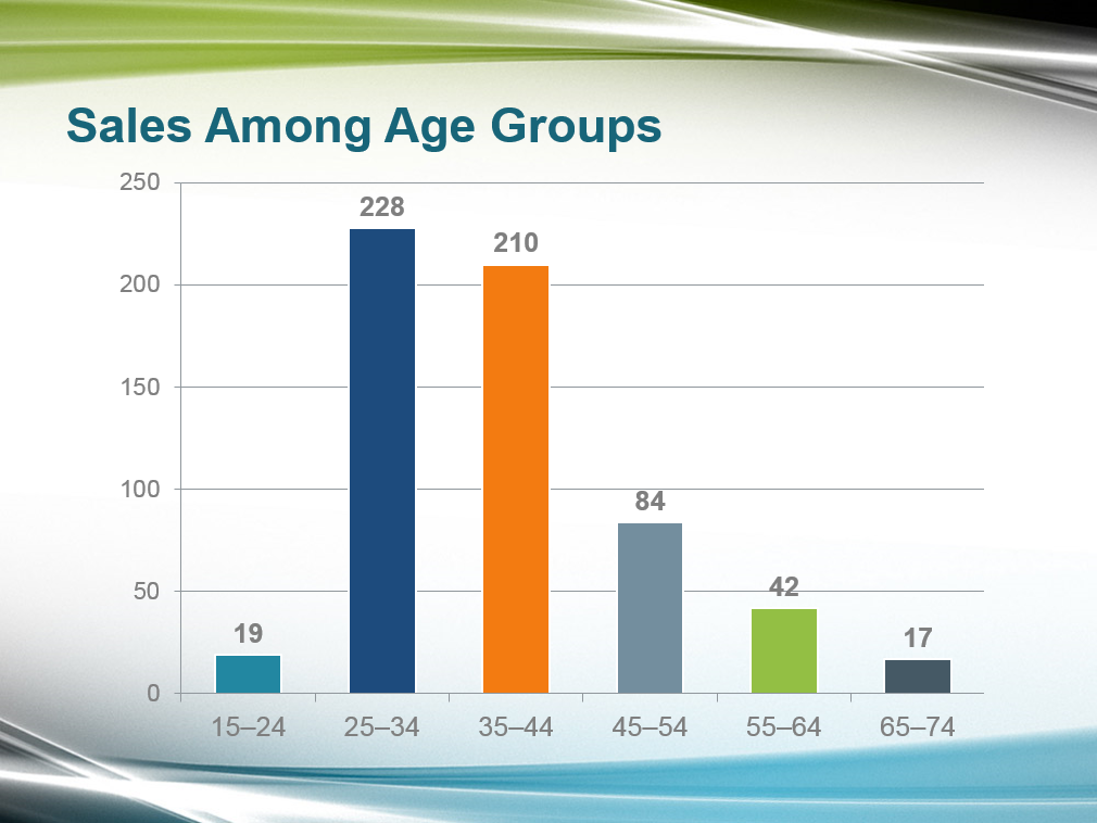
The Sales file contains only one slide with a doughnut chart like the one we created in the previous exercise. Because our presentation already has a doughnut chart, we'll be converting this chart into a column chart. The data will also be better represented in a column chart because the higher-ups want solid sales numbers instead of seeing the percentage of sales in each age group.
1. In the Slides list on the left, click on the single slide to select it.
2. Copy it (Cmd–C (Mac) or Ctrl–C (Windows)).
3. We're done with Sales.pptx, so close it. You should be back in Column Chart.pptx.
4. In the Slides list on the left, scroll down and click on the Coworking Demographics (pie chart) slide.
5. Paste it (Cmd–V (Mac) or Ctrl–V (Windows)).
There are some elements on this slide that we won't need for the new column chart (we only want to keep the pie chart and title placeholder).
6. First, click on a blank area of the slide to deselect everything.
7. Select everything on the page.
8. Shift–click on the title placeholder and the legend to deselect them. (We'll delete it soon, but clicking the legend deselected the chart for us.)
9. Press Delete/Backspace to delete all the elements that are still selected.
10. Select and delete both the legend and data labels (percentages) as well.
11. Make sure the title and the pie chart are the only elements on the slide, as shown:
![]()
Converting the Chart
1. Click once on the chart to select it.
2. At the top of the ribbon, click the (Chart) Design tab.
3. On the upper right, click the Change Chart Type button.
4. Click on Column and choose Clustered Column. (Windows users will need to double–click on the first option.)
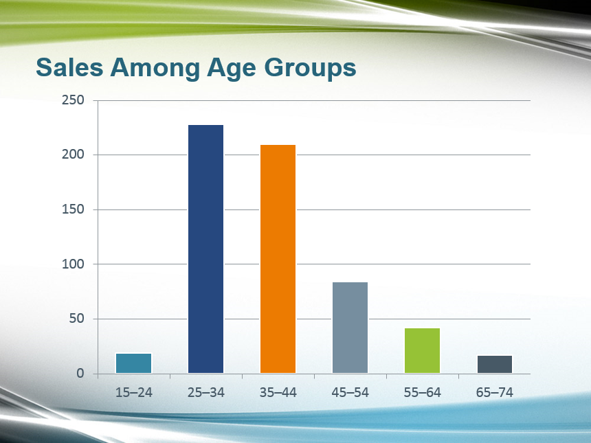
You'll see that our pie chart has been turned into a column chart, and all the styling we applied earlier is still intact!
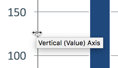
5. We need to resize the chart so it fills more of the slide. Click on the blank white Plot Area of the chart (between the graph lines) to select the whole chart.
6. Mouse over the resizing handle between 100 and 150 and drag it to the left to scale the chart so that it fills most of the slide:
7. Click off of the chart to deselect it and get a better view. Feel free to center and scale more if needed, so the chart looks like this:
Editing Fonts & Adding Data Labels Above the Chart
The chart is almost done, but we want to tone down the font color a bit to help emphasize the data labels we'll add at the top of the chart. Let's also make all of our text Arial to match the rest of the presentation.
1. Select the y-axis by clicking on the 250 at the top left of the chart.
2. In the Home tab, in the Font section, set the formatting to:
- Font Color: White, Background 1, Darker 50% (last swatch under the first theme color, White)
- Font: Arial
- Font Size: 16 pt
3. Select the x-axis by clicking on any of the number ranges at the bottom.
4. In the Home tab, in the Font section, set the formatting to:
- Font Color: White, Background 1, Darker 50% (same one)
- Font: Arial
TIP: You can click the icon part of the Font Color button to quickly apply the font color that you previously selected.
5. Let's add our data labels now. In order to do that, select all of the columns by clicking once on any of them.
6. In the (Chart) Design tab, click the Add Chart Element button then select Data Labels > Outside End (fifth option).
7. Notice that data labels now appear above the columns. Click once on any of the data labels to select them all.
8. In the Home tab, in the Font section, set the formatting to:
- Font Color: White, Background 1, Darker 50% (same one)
- Font: Arial
- Font Weight: Bold
9. Wow—charting in PowerPoint is off the charts! Save the file and close it.
Use the web-based JavaScript cleaner to organize and beautify scripts.
Master Microsoft Office
Microsoft Office is a suite of productivity tools that benefit not only individual users, but whole teams. Learn how to harness the full power of Office for your business. We offer the best Microsoft Office training in NYC. Our expert instructors help students create engaging presentations, generate reports on the fly, automate tasks, and more! Sign up individually, or contact us about corporate training today: