
In this exercise, you'll learn how to work with a pie chart. We'll be working with a variant of a pie chart called a doughnut chart. (It has a hole in the middle.)
NOTE: You will need to have Excel installed in order to complete this exercise.
Getting Started
1. If you have any presentations open, in PowerPoint, go to File > Close to close them. You may have to close more than one.
2. Still in PowerPoint, go to File > Open to open the next project.
3. Under Open, click on On my Mac or This PC.
4. Navigate to the Desktop > Class Files > yourname-PowerPoint 2016 Class folder.
5. Double–click Pie Chart.pptx to open it.
6. In the Slides list, select the Line Chart slide (we just finished it).
7. In the Home tab, click the arrow part of the New Slide button and choose Title and Content.
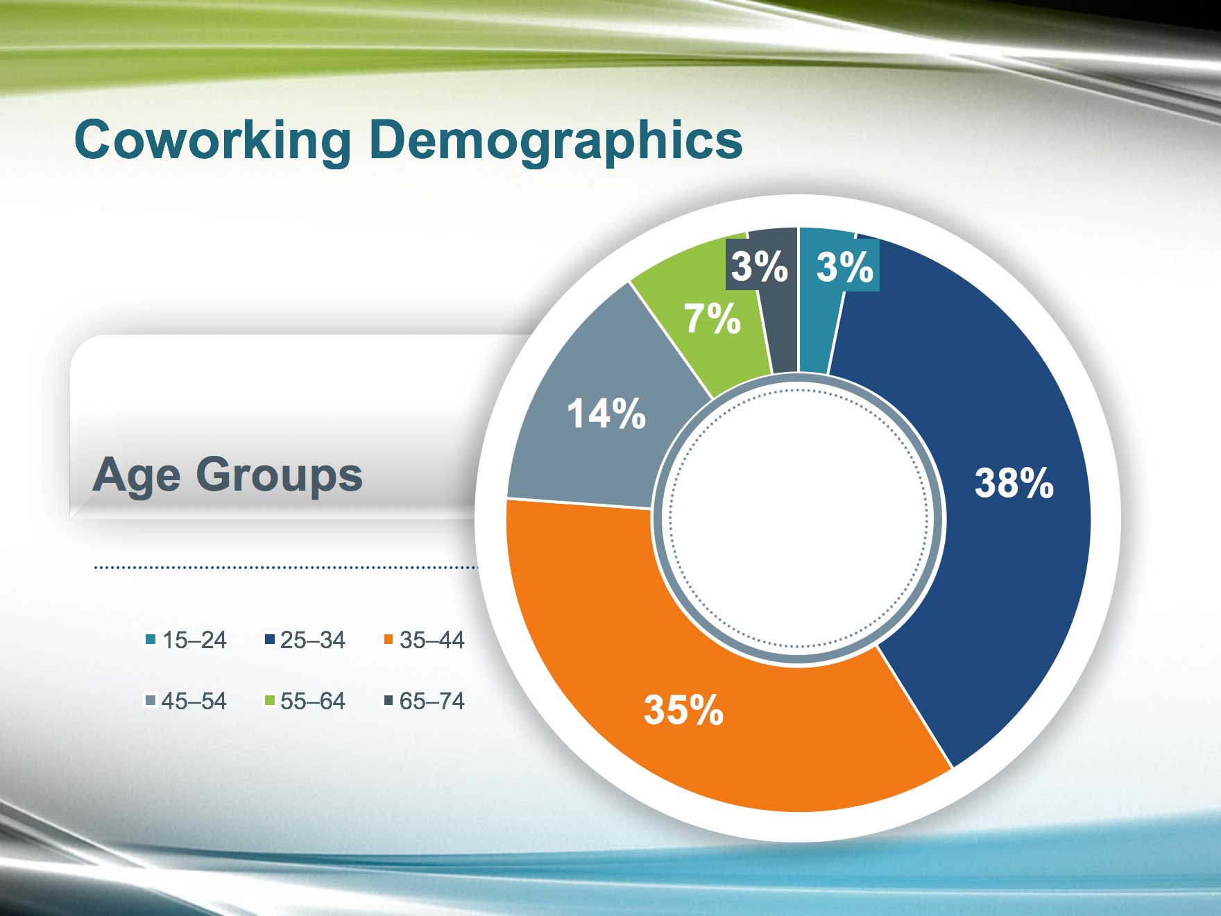
8. In the title placeholder, type: Coworking Demographics
9. In the center of the content placeholder, click on the Insert Chart icon.
![]()
10. Click on Pie and choose Doughnut. (Windows users will need to double–click on the last option.)
Entering Chart Data in Excel
When the new chart appears on the slide, an Excel window opens. It displays the data associated with the chart. On Windows, it's a mini embedded version that doesn't have full functionality, which we don't need when working in PowerPoint.
1. In the Excel window, click on cell A1. This first header column lists the title that describes the categories (subsets of data) we are measuring. Type: Age Groups
2. Press Tab to move to the second header column, cell B1.
3. Replace the text with: Values because it defines the data values for each category.
4. Press Tab again to select the next cell. Because the bounding box has two columns (which is what we want), this selects A2, which represents an individual category.
5. Type: 15–24 (For proper typography, type an endash (–) by pressing Opt–(-) (Mac) or Alt–0150 on the number pad on the right of your keyboard (Windows).)
6. Press Return/Enter to advance to the next cell in the column.
7. Our doughnut chart will display the total sales numbers per age group. Use the image below to fill in the rest of the data, pressing Tab or Return/Enter as needed:
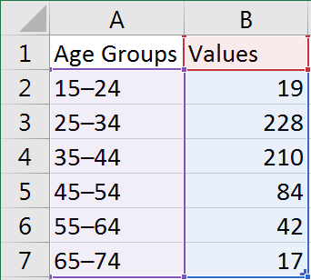
NOTE: We will format these values as percentages later. Formatting a value like 0.50% is another way to display percentages, but this way gives us more flexibility. We may need the exact sales numbers later.
8. Close the Excel window. The data was updated in PowerPoint!
Styling the Doughnut Chart
1. Select the Chart Area by clicking in the area between the doughnut chart and the legend (the age categories).
2. In the (Chart) Design tab and on the left side, click the Quick Layout button.
3. In the upper right-hand corner, choose the third option, Layout 3. (On Mac it just shows a doughnut with a bottom legend.) Quite snazzy for a click of a button, and it took care of deleting the Values text.
4. In the (Chart) Format tab, in the Size section, set Height to 5.24" and Width to 7.96."
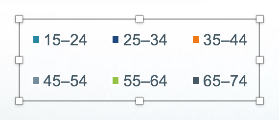
5. Right-click on the legend (the age categories) and select Format Legend.
6. In the Legend Options panel that appears on the right, select Left to move it to the left of the chart.
7. In the Home tab, set the legend's font to Arial.
8. Set the legend's font size to 14 pt.
9. With the legend still selected, drag the horizontal and vertical bounding box handles to rearrange its content into two rows. Get the dimensions similar to:
10. Move the legend down to the lower left where there is more room.
11. The doughnut chart is a bit close to the legend. Drag the doughnut chart by its center a bit to the right until the slide looks more balanced.
NOTE: We're dragging by the center because if we were instead to drag by a colored section (called a Category), the doughnut chart would disassemble itself—not what we want.
Adding Data Labels
As it stands now, we don't know the exact percentages for each colored category. Let's make the data labels visible and format them into percentages!
1. Select the doughnut chart by clicking once on any of the colored sections.
2. In the (Chart) Design tab, click the Add Chart Element button (it's on the left) then select Data Labels > More Data Label Options.
This creates data labels and automatically selects them for styling. The data labels are currently displaying the hard sales numbers. Because pie charts excel at showing percentages, we want to convert the values to percentages.
3. In the Format Data Labels panel that appears on the right, make sure you are in the Label Options tab.
4. In the panel:
- Check on Percentage.
- Uncheck Value and Show leader lines.
Yay, the values are now percentages!
5. With the data labels still selected, in the Home tab, set the following:
- Font: Arial
- Font Color: White, Background 1 (first theme color)
- Font Size: 24 pt
- Font Weight: Bold
6. Notice that the two 3% data labels at the top are overlapping. Let's re-position them. First, select the rightmost 3% data label and drag it up and to the right.
7. Drag the leftmost 3% data label up and to the left.
Recoloring the Doughnut Chart's Categories
The colors of the doughnut's slices correspond to the colors shown in the legend. By default, PowerPoint chose our accent colors. These match the presentation, but let's tweak them to add more impact to the larger categories.
1. Click on any of the doughnut's sections to select all of the categories (the actual doughnut).
2. Click on the rightmost 3% slice to select only the 15–24 age category.
3. In the (Chart) Format tab, click the arrow part of the Shape Fill button and choose the sixth theme color, Turquoise, Accent 2.
4. Moving clockwise, select the following categories, click the arrow part of the Shape Fill button and choose the following theme colors:
- 38%: Dark Blue, Text 2 (fourth theme color)
- 35%: Orange, Accent 4 (eighth theme color)
- 14%: Blue-Gray, Accent 5 (second to last theme color)
- 7%: Lime, Accent 1 (fifth theme color)
- Leftmost 3%: Blue-Gray, Text 1 (second theme color)
5. Looks good! But let's make the 3% data labels look more associated with their respective colors. First, select the leftmost 3% data label.
6. In the Home tab, in the Drawing section, click the icon part of the Shape Fill button to fill it with the second theme color, Blue-Gray, Text 1.
7. Select the rightmost 3% data label.
8. Click the arrow part of the Shape Fill button and choose the sixth theme color, Turquoise, Accent 2.
Enhancing the Chart's Appearance with Circles
Let's add some shapes to our chart to customize and enhance its appearance.
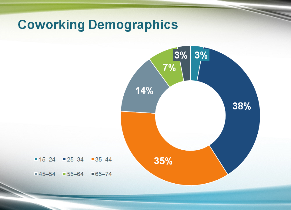
1. First, arrange the components of the layout to look like the screenshot below. (If you need to resize an item, Shift-drag any of its corner handles.) Make sure all objects are deselected before moving on to the next step.
2. Click a blank area of the slide to deselect the doughnut chart.
3. In the Insert tab, click the Shapes button and under Basic Shapes, choose Oval.
4. Click on the slide to make a default-sized circle.
5. In the (Shape) Format tab, set both the Height and Width to 5.3." This sizes the circle to be slightly larger than the doughnut chart.
6. Click on the circle to bring up its properties in the Format Shape panel.
7. Under Fill, click the Color menu and choose the first theme color, White, Background 1.
8. Under Line, select No line.
9. Near the top of the Format Shape panel, click the Effects button.
10. Under Shadow, click the Presets menu and under Outer, select Offset Center (the center option).
11. Set the following shadow settings:
- Transparency: 76%
- Size: 104%
- Blur: 19.5 pt
- Angle: 0°
- Distance: 0 pt
12. Place the circle over the doughnut chart. Don't worry about alignment yet.
13. Right-click on the circle and choose Send to Back > Send to Back.
14. Unfortunately, we have to align charts by sight. Move the circle so it is centered behind the doughnut, using the Arrow keys on the keyboard to fine-tune its position.
15. In the Insert tab, click the Shapes button and choose Oval.
16. Hold Option–Shift (Mac) or Ctrl-Shift (Windows) and drag from the center of the doughnut out to create a circle from the center.
17. Place the circle inside the empty space in the middle of the chart, as shown:
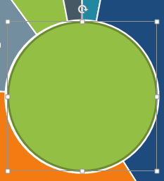
18. Double–click on the new circle to bring up its properties in the Format Shape panel.
19. Under Fill, select No fill.
20. Under Line, click the Color menu and choose the second to last theme color, Blue-Gray, Accent 5.
21. Also under Line, set Width to 5 pt.
22. Option-drag (Mac) or Ctrl–drag (Windows) out a copy of the circle to duplicate it.
23. Size the new circle so that it will fit in the empty space in the middle of the original circle.
24. Place the new circle over the original circle and resize it to fit inside the original circle's border, as seen below:
25. In the Format Shape panel, under Line, set the following:
- Width: 1.5 pt
- Dash type: Round Dot (second option)
- Cap type: Round
Enhancing the Chart's Appearance with Rectangles
Let's use another shape to further enhance the appearance of the doughnut chart slide. We'll copy a shape from a previous slide.
1. In the Slides list on the left, click on the Leaf Works Model slide (Slide 11).
2. Click on the COLLABORATION group, then the underlying gray/white gradient rectangle.
3. Copy the shape.
4. In the Slides list on the left, click back on the doughnut chart slide.
5. Paste the shape onto the slide.
6. In the (Shape) Format tab, on the left click the Text Box button. (This allows us to put text in the shape.)
7. Click on the shape and type: Age Groups
8. In the Home tab, in the Font section, set the formatting to:
- Font: Arial
- Font Size: 28 pt
- Font Color: Blue-Gray, Text 1 (second theme color)
- Font Weight: Bold
- Alignment: Align Left
- Align Text: Bottom
9. In the (Shape) Format tab, set Height to 1.5" and Width to 5.0."
10. Right-click on the shape and choose Send to Back > Send to Back.
11. Drag the shape so that it is slightly underneath the doughnut chart, and above the legend (move the legend and chart as desired), as seen below:

Now we're going to copy a line shape from a previous slide.
12. In the Slides list on the left, click on the quote slide (Slide 6).
13. Click on the line above the quote twice to select it.
14. Copy it.
15. In the Slides list, go back to the doughnut chart slide.
16. Paste it!
17. Drag the line in between the Age Groups shape and the legend. Make sure the left endpoint is to the left of the chart's bounding box.
18. Right-click on the line and choose Send to Back > Send to Back. Keep the line selected if you want to fine-tune its position by dragging or nudging it with the Arrow keys.
NOTE: Using the Arrow keys to nudge items that are completely inside the boundaries of a chart doesn't work, which is why we told you to keep the line's left endpoint outside the chart's bounding box.
19. Adjust any of the elements on the slide until you are satisfied with their positioning. Refer to the exercise preview at the beginning of the exercise if needed.
20. The world of doughnuts just got a little bit better. Save the file and head to Dunkin'!
Master Microsoft Office
Microsoft Office is a suite of productivity tools that benefit not only individual users, but whole teams. Learn how to harness the full power of Office for your business. We offer the best Microsoft Office training in NYC. Our expert instructors help students create engaging presentations, generate reports on the fly, automate tasks, and more! Sign up individually, or contact us about corporate training today: