
In this exercise, you'll learn how to work with a line chart.
Getting Started
1. If you have any presentations open, in PowerPoint, go to File > Close to close them. You may have to close more than one.
2. Still in PowerPoint, go to File > Open to open the next project.
3. Under Open, click on On my Mac or This PC.
4. Navigate to the Desktop > Class Files > yourname-PowerPoint 2016 Class folder.
5. Double–click Line Chart.pptx to open it.
6. In the Slides list on the left, select the What Is Coworking? slide (Slide 3).
7. In the Home tab, click the arrow part of the New Slide button and choose Title Only.
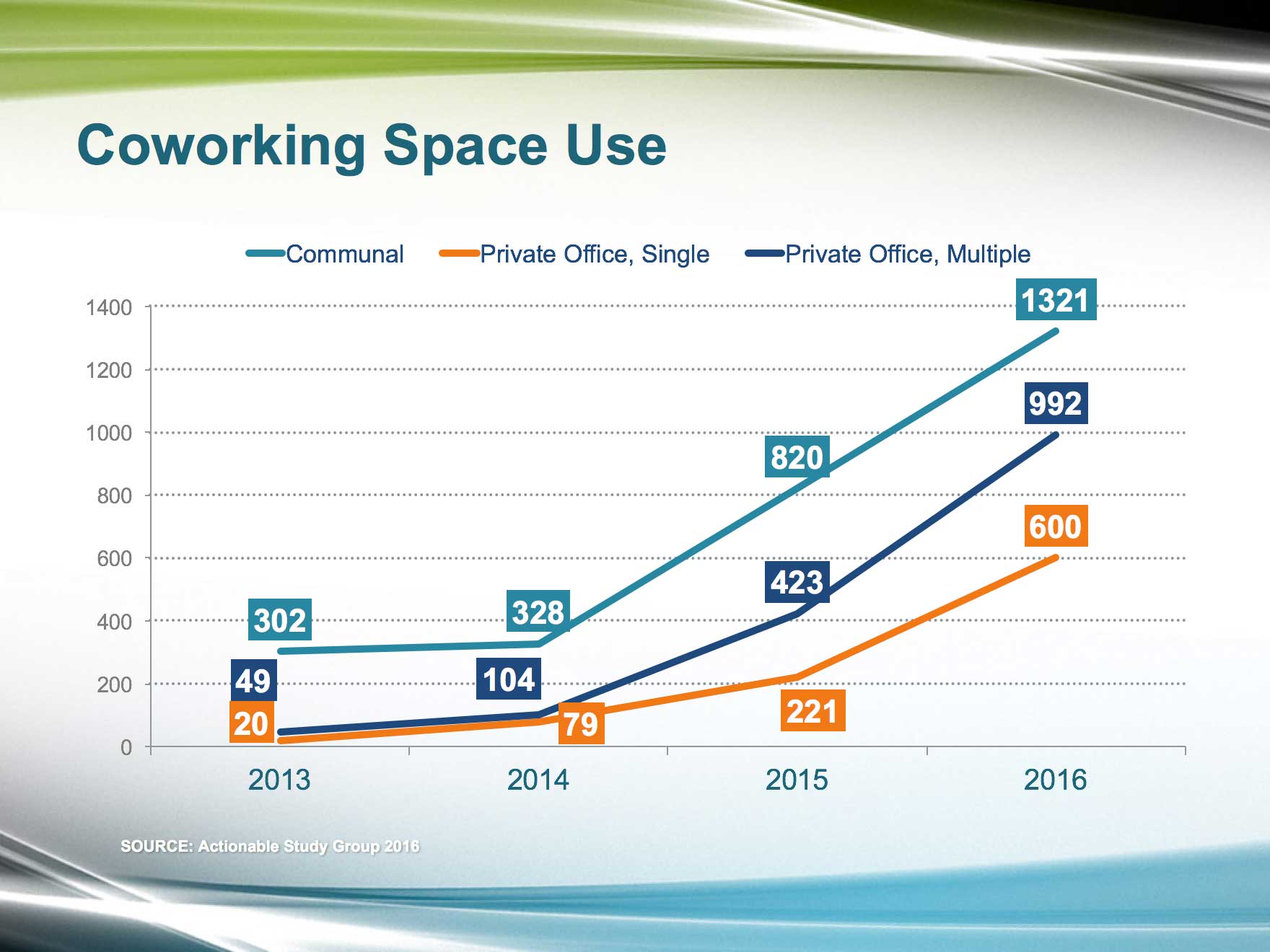
8. In the title placeholder, type: Coworking Space Use
9. Go to File > Open to open the old presentation we'll take our chart from.
10. Under Open, click on On my Mac or This PC.
11. Navigate to the Desktop > Class Files > yourname-PowerPoint 2016 Class folder.
12. Double–click Content.pptx to open it.
13. On the Coworking Space Use slide (Slide 5), click on the chart's bounding box, then Shift-click the SOURCE text box below the chart to select both.
14. Copy them.
15. Switch back to Line Chart.pptx.
16. On the Coworking Space Use slide, paste the chart and text box.
17. Click on an empty area of the slide to deselect all.
Formatting the Line Chart
1. On the left of the chart, click on any number to select that column. The numbers are labels on the vertical y-axis.
2. In the Home tab, set the font formatting to:
- Font: Arial
- Font Size: 12 pt
- Font Color: White, Background 1, Darker 50% (the last gray color swatch under the first theme color, White)
3. Click on the legend at the top of the chart (the horizontal row at the very top).
4. Set the legend's font formatting to:
- Font: Arial
- Font Size: 14 pt
- Font Color: Dark Blue, Text 2 (fourth theme color)
5. On the bottom of the chart, click on any of the year numbers to select that row. The year numbers are labels on the horizontal x-axis.
6. Set the font formatting to:
- Font: Arial
- Font Size: 16 pt
- Font Color: Turquoise, Accent 2, Darker 25% (fifth row under the sixth theme color, Turquoise)
7. Click in the dark gray background area that surrounds the chart on all sides.
8. In the Home tab, in the Drawing section, click the arrow part of the Shape Fill button and choose No Fill.
9. Deselect the background by clicking off of the chart.
10. Click in the chart's lighter gray background area (the area behind the horizontal gridlines on the Plot Area).
11. Click the icon part of the Shape Fill button. Voilà, no more fill!
12. Notice that there are three gray graph lines on the chart (the lightest one may be hard to see). Hover over each of these lines (called Data Series, indicating that they are a subset of your data) to see that an information bubble appears.
13. Click on the darkest gray line, labeled Series "Communal"...
14. In the Home tab, click the arrow part of the Shape Outline button and choose the sixth theme color, Turquoise, Accent 2.
15. Click on the middle gray line, labeled Series "Private Office, Multiple"...
16. Click the arrow part of the Shape Outline button (Windows) and choose the fourth theme color, Dark Blue, Text 2.
17. Click on the light gray line, labeled Series "Private Office, Single"...
18. Click the arrow part of the Shape Outline button and choose the eighth theme color, Orange, Accent 4.
19. Click on any horizontal gridline in the chart's background to select them all.
20. Right-click on any of the selected gridlines, choose Format Gridlines, and change:
- Width: 1.5 pt
- Dash type: Round Dot (second option)
- Cap type: Round
Showing Exact Values with Data Labels
So far, it's hard to tell what the exact values of our data points are. To get rid of any ambiguity, we want to show these values. Let's add data labels to show the yearly values associated with the three data series lines.
1. Click on the chart's bounding box.
2. Look in the Ribbon at the top. Notice that there are two new tabs at the top:
- Mac: Chart Design and Layout
- Windows: Chart Tools > Design and Chart Tools > Layout
NOTE: Because the name for these tabs is different on Mac and Windows, we'll refer to them as the (Chart) Design and (Chart) Layout tabs from now on.
3. In the (Chart) Design tab, click the Add Chart Element button (it's on the left) then select Data Labels > Above.
Because the default text color of the data labels is white, we can't see them, but they're there. One of these labels is located just above the left endpoint of the turquoise data series line.
4. Click there to select all four data labels for the Communal line.
Notice that the legend at the top of the chart shows the category titles for the data series lines and is color-coded to match the data series lines.
5. In the Home tab, in the Drawing section, click the arrow part of the Shape Fill button and choose the sixth theme color, Turquoise, Accent 2.
6. In the Home tab, in the Font section, change the font to Arial.
7. Click the Bold button to emphasize the data labels.
8. Select the data labels for the Private Office, Multiple line (click just above the left end of the dark blue line).
9. Repeat the process you used to style the first data label series to make the data labels' shape fill Dark Blue, Text 2 (fourth theme color) and the font Arial Bold.
10. Select the data labels for the Private Office, Single line by clicking on the box just above the right end of the line.
11. Repeat the process to make the data labels' shape fill Orange, Accent 4 (eighth theme color) and the font Arial Bold.
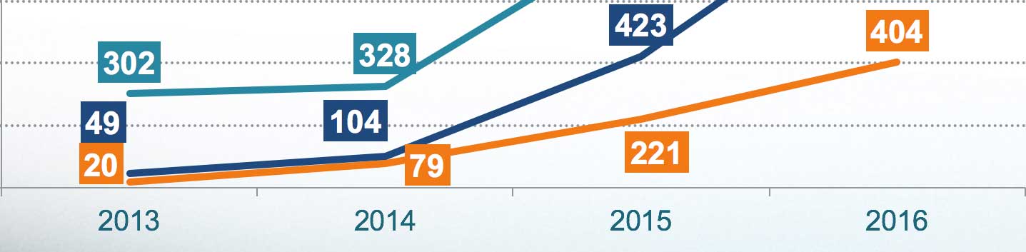
Data labels can be moved from their default positions on the chart. The 2013 and 2014 data labels for the lower two series cover each other, so let's adjust them.
12. Drag the 2013 and 2014 data labels for the blue and orange lines apart.
13. Drag the 221 data label below the orange line, as shown below:
Editing Chart Data Using Excel
1. What if one of these numbers changes? No problem! Double–click on any of the datapoint numbers to open the (Chart) Design tab.
2. In the (Chart) Design tab, click on Edit Data in Excel.
3. When Excel opens, change the number in cell E5 from 404 to 600.
4. Close the file.
You should see the orange 404 turns to 600 and the line change accordingly.
5. We're done with this chart! Save the file.
Master Microsoft Office
Office is the industry standard for desktop publishing. It offers a full suite of productivity tools and is always adding new features.
We offer the best Microsoft Office training in NYC. Keep up to date and learn how to create engaging presentations, generate reports on the fly, automate tasks, and more! Our expert instructors guide students of all levels through step-by-step projects with real-world applications. Sign up individually, or contact us about corporate training today: