
Sometimes, a client will give you a picture of a chart. Because pictures of charts are less versatile and are usually too blurry for a professional presentation, it'll often be your job to recreate them into workable charts. In this exercise, you will learn the ropes for creating a professional chart based on a mere picture of one.
Getting Started
1. If you have any presentations open, in PowerPoint, go to File > Close to close them. You may have to close more than one.
2. Still in PowerPoint, go to File > Open to open the next project.
3. Under Open, click on On my Mac or This PC.
4. Navigate to the Desktop > Class Files > yourname-PowerPoint 2016 Class folder.
5. Double-click Flat Chart.pptx to open it.
Importing & Studying the Chart Picture
1. Go to File > Open to open the presentation with the picture we'll convert into a workable chart.
2. Under Open, click on On my Mac or This PC.
3. Navigate to the Desktop > Class Files > yourname-PowerPoint 2016 Class folder.
4. Double-click Appendix.pptx to open it.
5. In the Slides list on the left, click on Slide 3.
6. Click on the picture of the chart to select it.
7. Copy it.
8. We're done with Appendix.pptx, so close it. You should be back in Flat Chart.pptx.
9. In the Slides list, right under the Appendix section title, click in the narrow gray area.
10. In the Home tab, click the arrow part of the New Slide button and choose Title Only.
11. Click into the title placeholder and type: Geographical Targets
12. Paste the chart picture into the slide.
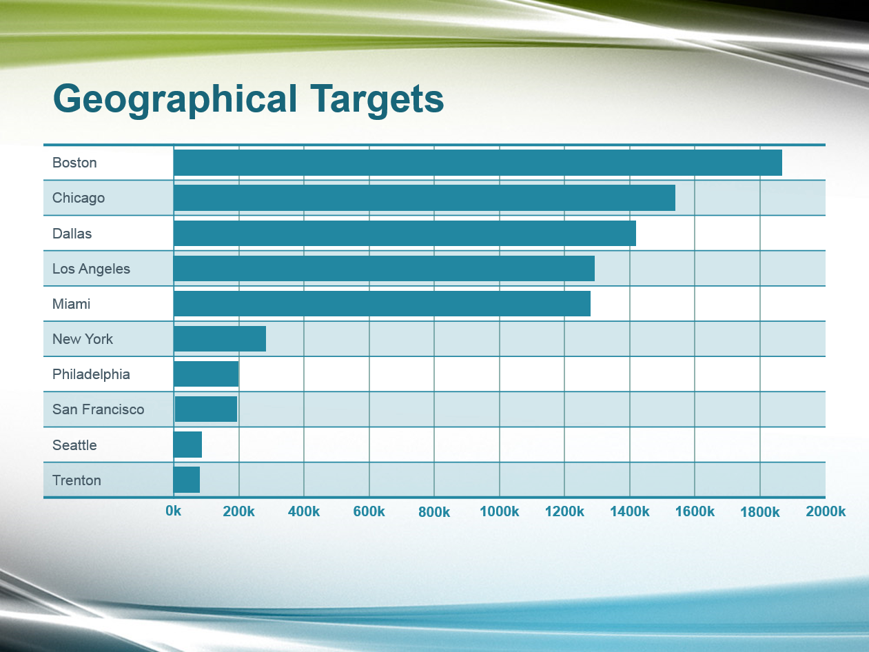
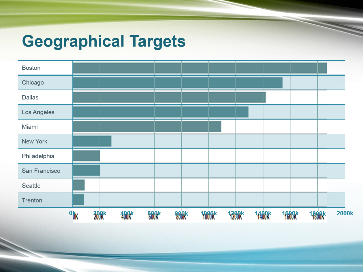
13. Study the chart and dissect it into lines, shapes, tables, and text so you can determine how best to recreate this chart. We'll use this image to create a crisp, professional-looking product that we can style. Ready?
14. Save the file.
Using a Table to Reproduce a Chart: The Y-Axis
Admittedly, it's not often that you'll be able to recreate a chart in PowerPoint all that well. But line charts and bar graphs aren't tall orders! Let's get crackin'.
1. On the left of the chart picture, study the city names. Luckily, they've been used previously in this presentation: in the office income chart slide we made earlier.
2. In the Slides list, click on the Leaf Works Office Income (2016) slide (Slide 12).
3. Click into the Boston cell, then Shift-click on the Trenton cell to select all of the city names.
4. Copy them.
5. In the Slides list, go back to the slide with the chart picture.
6. Paste the city names.
7. Confirm that the pasted cities match the cities column in the chart picture.
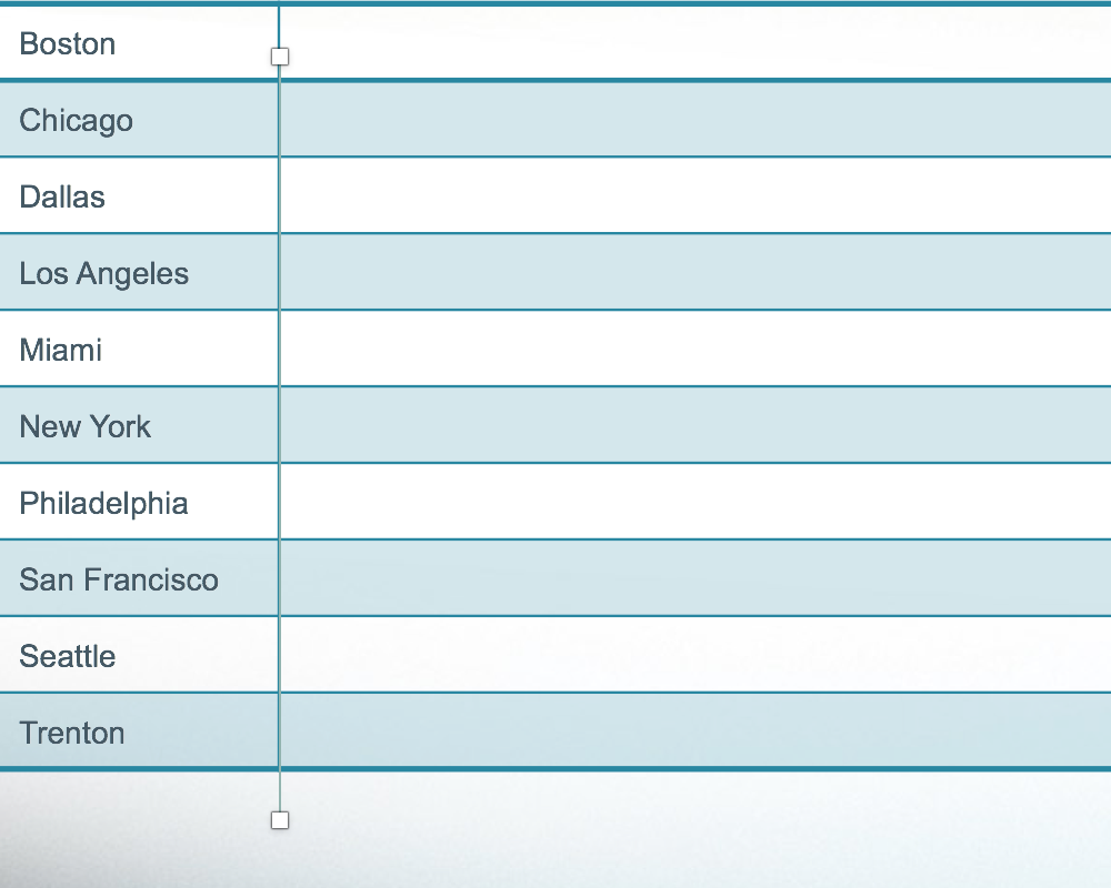
8. Let's style our new "y-axis." Click on the bounding box of the cities column.
9. In the Home tab, click the Bold button to unbold all of the city names.
While the cities are still selected, let's add a top border to match the bottom one.
10. In the (Table) Design tab, in the Draw Borders section, click the arrow part of the Pen Color button and select the sixth theme color, Turquoise, Accent 2.
NOTE: Remember that on Windows, the Design tab is grouped under the Table Tools. We won't remind you again.
11. In the Pen Weight menu, choose 2.25 pt.
12. Click the arrow part of the Borders button and choose Top Border.
13. Save the file.
Using a Table to Reproduce a Chart: The Chart Area
Let's add the rest of the chart area, then style the vertical line between the cities and the chart area so it can act as a divider between the y-axis and the values.
1. We don't need the chart picture yet, so drag it to the right, off of the slide.
NOTE: If you can't see enough of the gray area to move the text box, Zoom Out until you can see it. Once you're done, click Fit slide to current window.
2. In the View tab, check on Ruler if it isn't already selected.
3. In the table on the slide, click into any cell, then Right-click on any of the cells and go to Insert > Insert Columns to the Right.
4. Drag the right edge of the table's bounding box (not the chart picture!) so that there is a 1/2" margin between the table and the right edge of the slide.
5. Drag the left edge of the table's bounding box so that there's a 1/2" margin between the table and the left edge.
6. In the table, drag the vertical divider line so that it is slightly to the right of the city names (about 1/2" past San Francisco is good).
7. Click on the table's bounding box so we can style it.
8. In the (Table) Design tab, click the Pen Weight menu and select 1 pt.
9. Click the arrow part of the Borders button and select Inside Vertical Border. The divider line now has the same style as the top and bottom border, except it's a little thinner.
10. Let's remove the border on the right edge. Still in the (Table) Design tab, click the Pen Style menu and select No Border.
11. Click the arrow part of the Borders button. Choose Right Border.
12. Save the file.
Quickly Selecting Rows & Columns
You can quickly select an entire column or row by clicking a little to the top or bottom of a column, or a little to the left or right of a row. To select a range of multiple rows or columns, you can hold Shift. Let's try it.
1. Hover above the Boston cell, just slightly above the bounding box's border. When a down arrow appears, click to select the column:
NOTE: If you're having trouble with this, just select the Boston cell and then Shift-click on the last cell to select all the cities.
2. In the Home tab, click the Increase Font Size button until the font size is 12 pt.
3. If text is overflowing, drag the divider line to the right, away from the cities column.
Tick Marks: Line Distribution & Arrangement
1. In the Insert tab, click the Shapes button, then click the Line shape.
2. Hold Shift and drag out a straight vertical line.
3. In the (Shape) Format tab, set Height to 4.05."
4. In the Home tab, click the arrow part of the Shape Outline button (Windows) and choose the seventh theme color, Green, Accent 3.
5. Click the arrow part of the Shape Outline button again and go to Dashes > Solid (first option).
6. Click the arrow part of the Shape Outline button one more time and go to Weight > 1 pt.
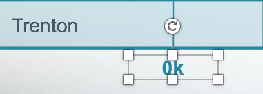
7. Drag and then nudge the vertical line so that it aligns with the divider between the cities column and the empty chart area.
8. We'll use this line and the rightmost edge of the table to distribute several lines that we'll add to the chart to form the tick marks on the x-axis. So, make sure its bottom end is lower than the bottom edge of the table, as seen in the screenshot below:
9. With the line selected, press Cmd-D (Mac) or Ctrl-D (Windows) 10 times to duplicate it 10 times.
10. Make sure that all the lines' bottom ends are below the bottom edge of the table. This is because we'll top-align to a higher line next.
11. Let's make one of the lines higher now. Drag the rightmost line so that it aligns perfectly with the right edge of the table, connecting with both the top and bottom of it.
12. Drag a selection box around all of the lines, including the rightmost one that's aligned with the divider—but don't select the entire table!
13. In the Home tab, click Arrange and go to Align > Distribute Horizontally.
14. With all the lines still selected, Shift-click on the table to select it as well.
15. Click the Arrange button again and go to Align > Align Top.
16. We don't need the leftmost and rightmost lines anymore. So we're able to delete them both, click on a blank area of the slide to deselect everything.
17. Click on the line on top of the divider then Shift-click the line on the right edge of the table to select both.
18. Press Delete/Backspace to delete them.
19. Drag a selection box around the remaining tick marks so we can move them behind the horizontal line at the bottom.
20. In the Home tab, click the Arrange button and select Send Backward.
21. Save the file.
Distributing Text Boxes via Duplication
Let's create values for the x-axis that we'll position below the tick marks we aligned and distributed. Let's create and format several text boxes to serve that purpose. While we're at it, let's use a nifty trick to distribute the text boxes. In PowerPoint, as long as you carefully align the first few objects so they have the same amount of distance in between them, you can duplicate them in the exact place you want!
1. In the Insert tab, click the Text Box button.
2. Below the table, drag out a small text box, approximately equal to the distance between tick marks (the vertical lines).
3. Type: 0k (that's a zero—this is the first of several numbered values).
4. Right-click on the text box and select Format Shape.
5. Click on Text Options, then click the Textbox button.
6. Above the margin values, choose Resize shape to fit text.
7. Set all of the margin values to 0 (press Tab to select the next field).
8. With the text box's bounding box selected, in the Home tab, set the following:
- Alignment: Center
- Font Size: 12 pt
9. Drag the text box until it looks perfectly center-aligned below the divider line to the right of the cities, as shown:
10. While holding Option-Shift (Mac) or Ctrl-Shift (Windows), drag the text box to the right, placing it under the first tick mark. Make sure that the vertical alignment guide shows up, or it snaps into place.
11. Press Cmd-D (Mac) or Ctrl-D (Windows) to duplicate the new text box.
12. Drag the text box to the right so that it aligns vertically with the next tick mark, and horizontally with the previous text box. Dashed alignment guides should appear to help you align, as shown in the screenshot below:
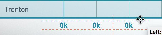
13. Let's try the nifty distribution trick! Press Cmd-D (Mac) or Ctrl-D (Windows) as many times as needed until the 0k text boxes go all the way to the right end of the chart, as seen below:

NOTE: If this didn't work, undo and repeat the last few steps exactly as they're written; you may not have been exact the first time.
14. Next, let's edit all of the x-axis points. First, replace the second 0k with: 200k
15. Replace the third 0k with: 400k
16. Continue editing in intervals of 200k until the rightmost value is 2000k:

17. Save the file.
Incorporating the Chart Picture
1. In the gray area to the right of the slide, click on the chart picture to select it (remember that you can Zoom In or Zoom Out as needed).
2. Drag the chart picture on top of the chart you've been working on.
3. With the chart picture selected, in the (Picture) Format tab, click the icon part of the Crop button.
Notice that small black lines have appeared on the edges of the shape to indicate ways in which the image can be cropped.
4. Drag the left black line to the chart picture's 0k mark (at the start of the bars).
5. Drag the right black line to the very end of the Boston bar (a little to the right of 1800k).
6. Click the icon part of the Crop button to apply the crop.
7. Drag the chart picture so that its left edge aligns with the 0k mark.
8. Drag the chart picture's right edge so that its 1800k mark aligns with the 1800k mark we typed in one of the text boxes on the x-axis.
9. Drag the chart picture's bottom and top edges so that the bars align next to the cities, nudging when necessary. When done, your chart should look like this:
10. Save the file.
Using Shapes to Reproduce Value Bars
The bars on the chart picture are blurry, and they'll look blurrier on a projector or in fullscreen mode. Let's create appropriately-sized rectangle shapes directly on top of them, and then delete the chart picture when we're done.
1. In the Insert tab, click the Shapes button, then click the Rectangle shape.
2. Drag the cursor on the slide to create a rectangle that exactly fits the first value bar found on the chart picture underneath it.
3. With the rectangle selected, in the Home tab, click the Quick Styles button and select the first option: Colored Outline - Blue-Gray, Dark 1.
4. Click the arrow part of the Shape Outline button and choose No Outline.
5. Click the arrow part of the Shape Fill button and choose the sixth theme color, Turquoise, Accent 2.
6. Hold Option-Shift (Mac) or Ctrl-Shift (Windows) and drag down a copy of the rectangle.
We don't need the new rectangle's vertical placement to be exact, because we'll later distribute all of the value rectangles vertically. The left edge should already be aligned, so only the right edge needs to be adjusted.
7. Drag the right edge so that it aligns with the right edge of its corresponding value bar on the chart picture.
8. Continue to create copies of the rectangles and adjust their right edges until each city has a rectangle and the value it shows matches the chart picture.
9. Make sure that the top and bottom rectangles are perfectly aligned within their "cell" because we'll use them to distribute vertically next.
10. Now that each city has a corresponding rectangle, we're done with the chart picture. Click on the chart picture's bounding box and press Delete/Backspace.
11. Select the 10 rectangles (the bars you just made).
12. In the (Shape) Format tab, click the Align button and choose Distribute Vertically.
Notice that the border below the Boston row doesn't match the other city rows.
13. Hover over the area slightly to the left of the Boston cell's bounding box. When a right arrow appears, click to select the row.
14. In the (Table) Design tab, in the Draw Borders section, click the Pen Style menu and select Solid (the first option).
15. Make sure these options are still selected:
- Pen Weight: 1 pt
- Pen Color: Turquoise, Accent 2 (sixth theme color)
16. Still in the (Table) Design tab, in the Table Styles section, click the arrow part of the Borders button and choose Bottom Border.
17. That's a wrap! Save the file.
Master Microsoft Office
Office helps users create professional reports, presentations, records, data sets, and more. PowerPoint, along with other apps such as Excel, is an essential tool for anyone working in a business setting.
We offer the best Microsoft Office training in NYC. Our expert instructors guide students of all levels through step-by-step projects with real-world applications. Sign up individually, or contact us about corporate training today: